Unit, item and spell information
Tooltips use dark backgrounds, thin borders and the same font as the rest of RikUI. Item comparisons keep separate panels beside the main tooltip.
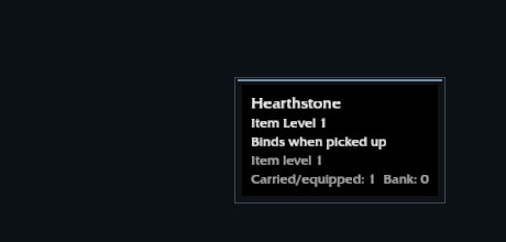
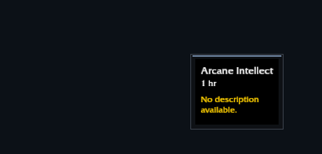
Item levels and spell IDs appear where available. Aura tooltips show the effect you are hovering. Unit tooltips carry a health bar under the text.
Size and position
Open Settings → Tooltips to adjust tooltip scale from 75% to 150%. Move the control under the picture to compare sizes.
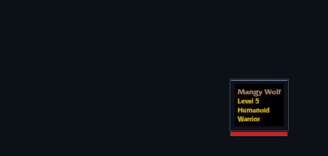
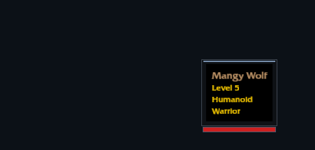
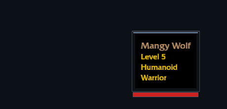
Use /rik move to place the tooltip anchor. Tooltips attached to specific controls, such as the help text in Settings, still appear beside those controls.